
Antonyan Artem
UX/UI Designer


ABOUT COMPANY
Oasis was founded in 1994 and occupies a leading position in Russia providing business souvenir products with individual applications, and more than 17,000 items and 22 types of application.
TASK
The company’s website had an outdated design, confusing UX, and an uncomfortable interface, yielding to its main competitors in the market of business souvenir gifts. All pages on the site needed to be updated to a modern form, and scripts of user interaction with the site reworked.
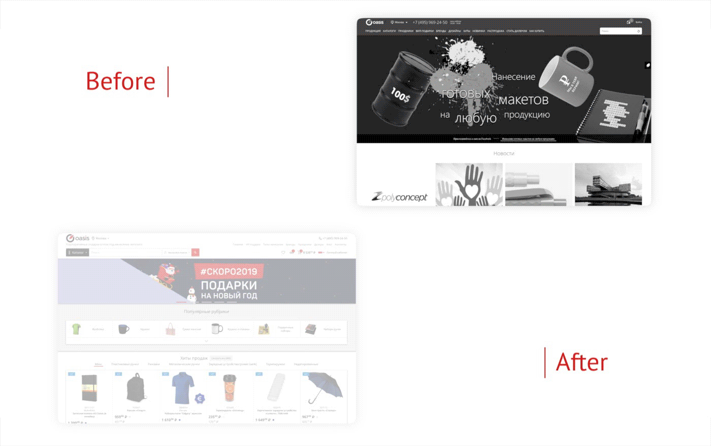
RESULT
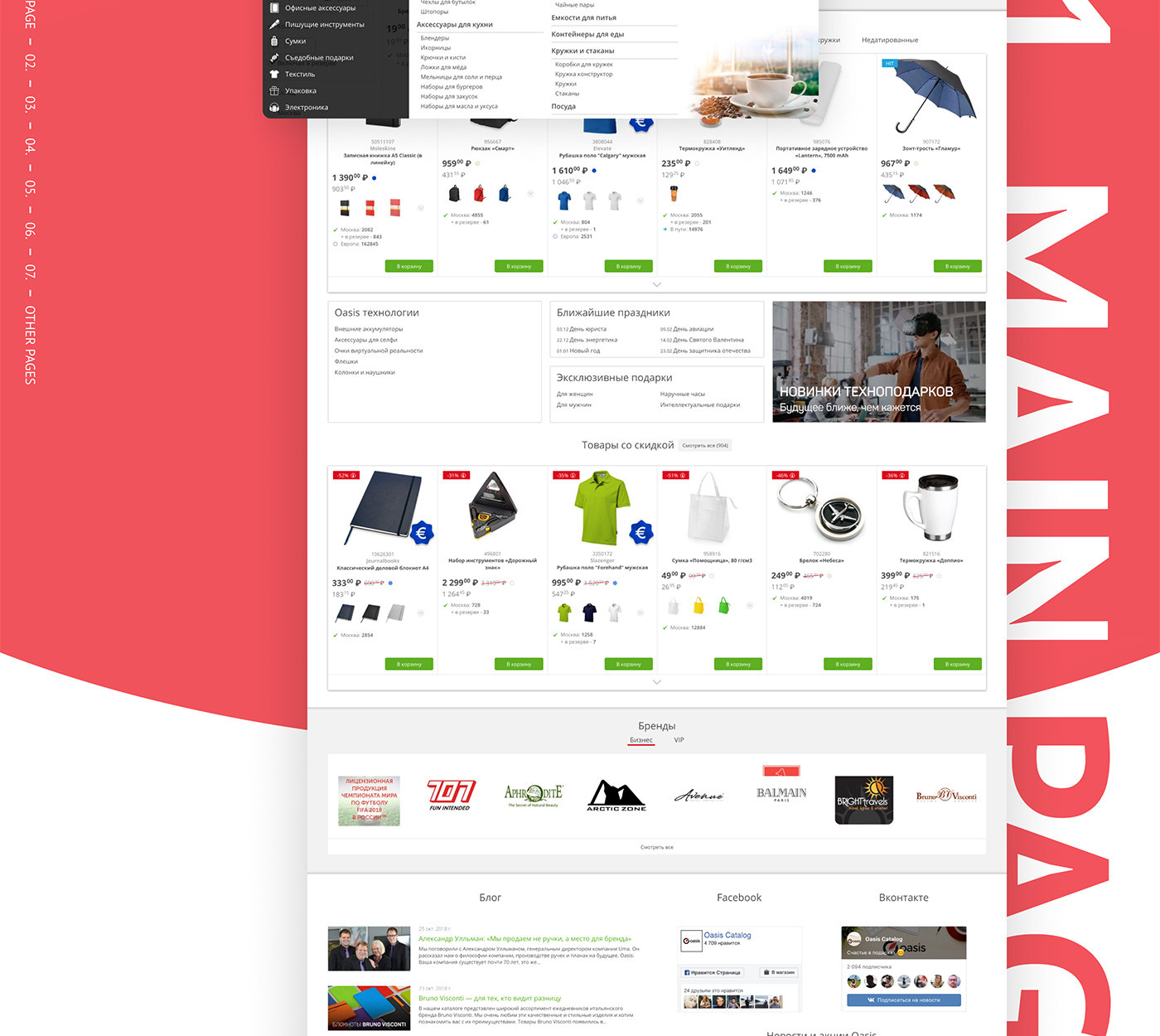
Several hundred screens were drawn showing the operation of each updated site element. Particular attention was paid to the main page of the site – the product page. The mechanism for adding an application to goods was redesigned down to the smallest detail. The account page is more user-friendly and more functional, which has led to increased site usage. The company is now taken much more seriously by dealers on the Internet. Since the update, the site is much more competitive with other business souvenir distributors.
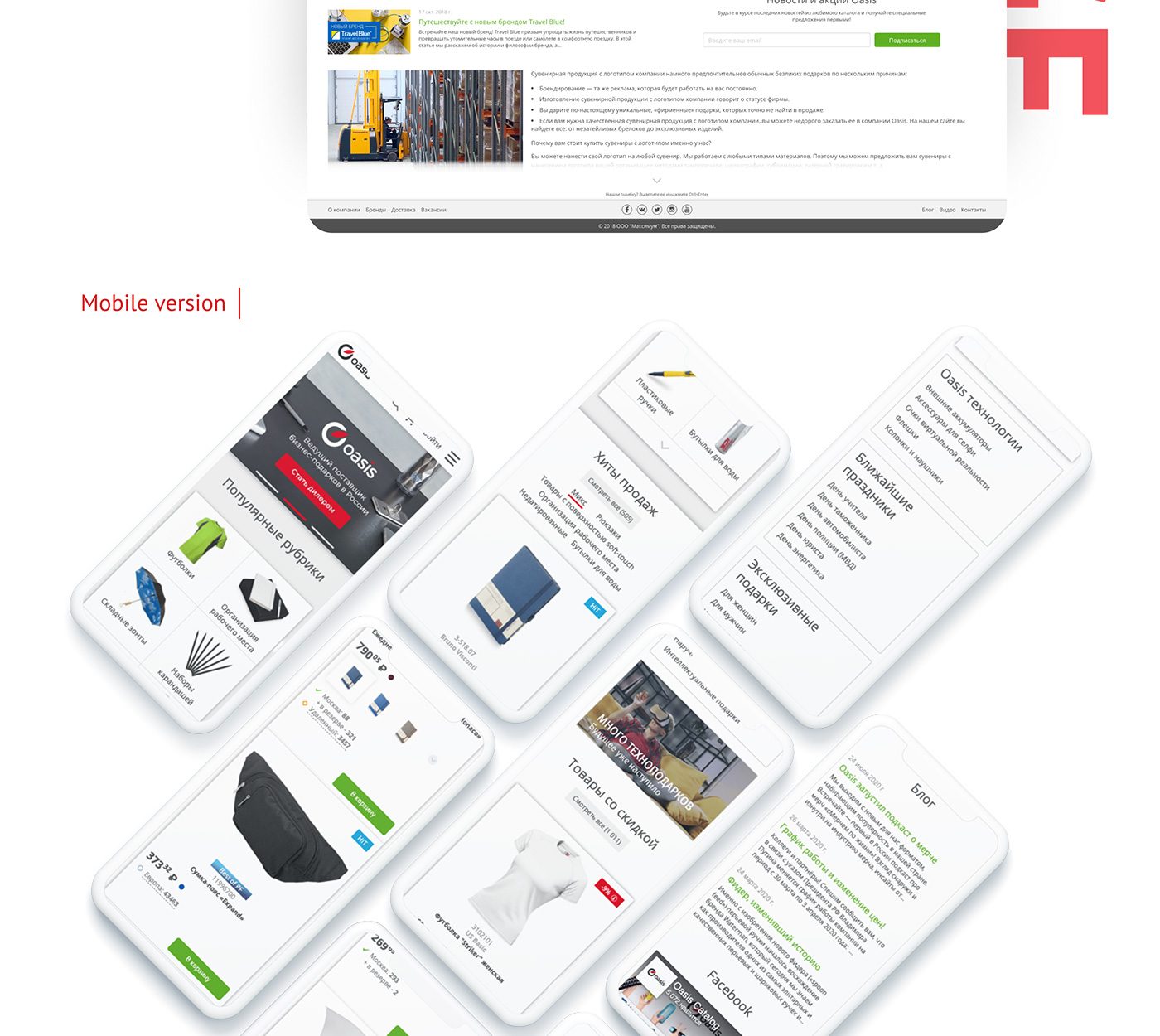
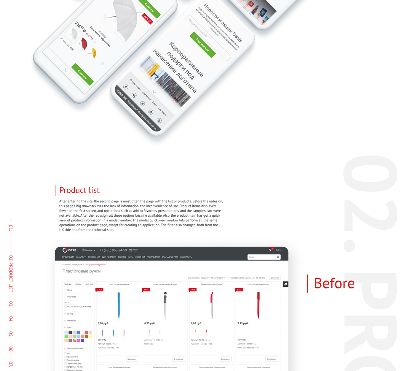
PRODUCT LIST
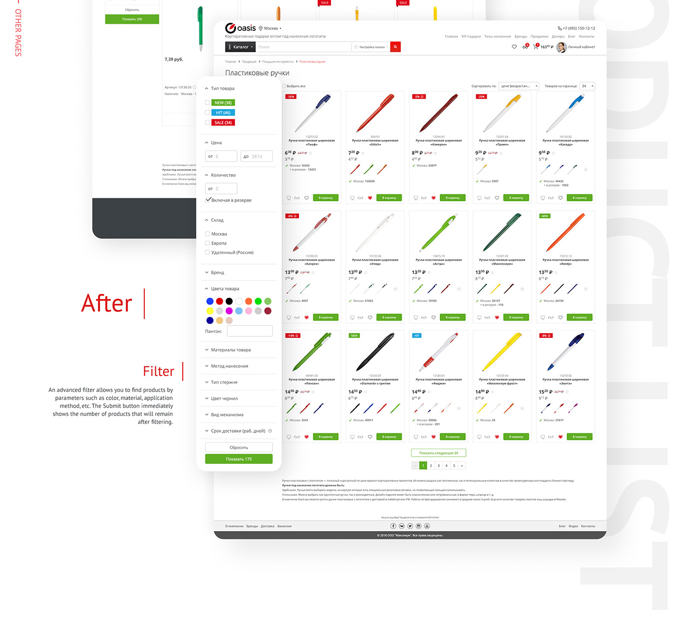
After entering the site, the second page is most often the page with the list of products. Before the redesign, this page’s big drawback was the lack of information and inconvenience of use. Product items displayed fewer on the first screen, and operations such as add to favourites, presentations, and the sample’s cart were not available. After the redesign, all these options became available. Also, the product item has got a quick view of product information in a modal window. The modal quick view window lets perform all the same operations on the product page, except for creating an application. The filter also changed, both from the UX side and from the technical side.
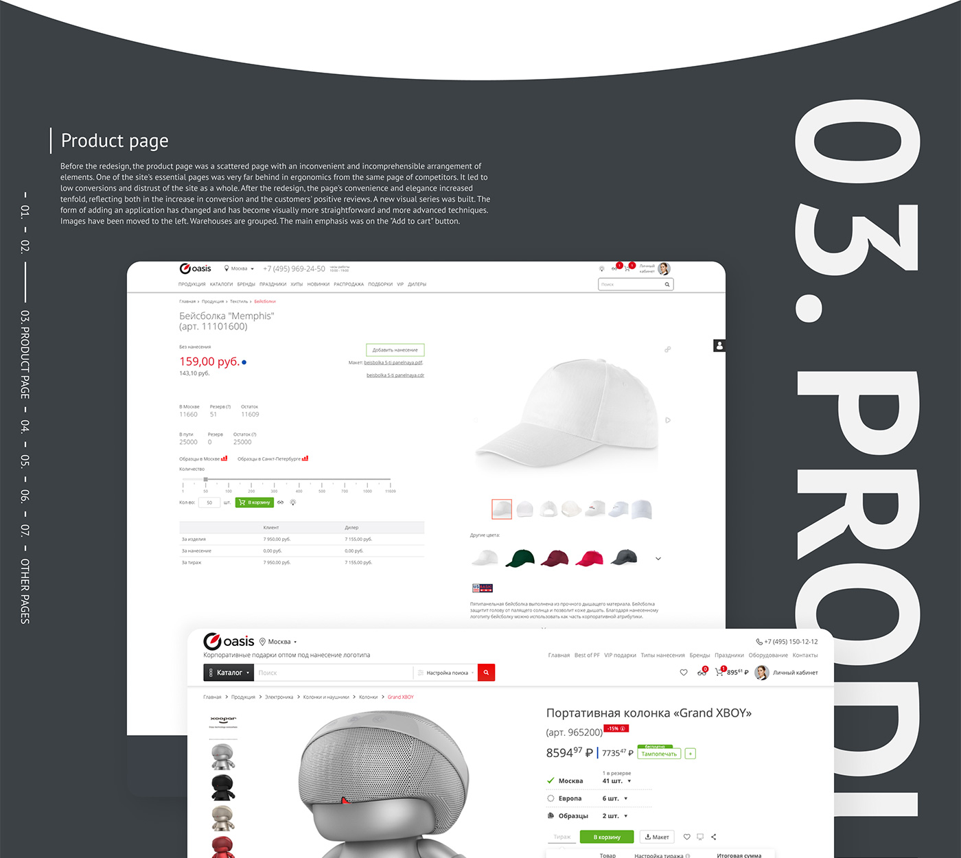
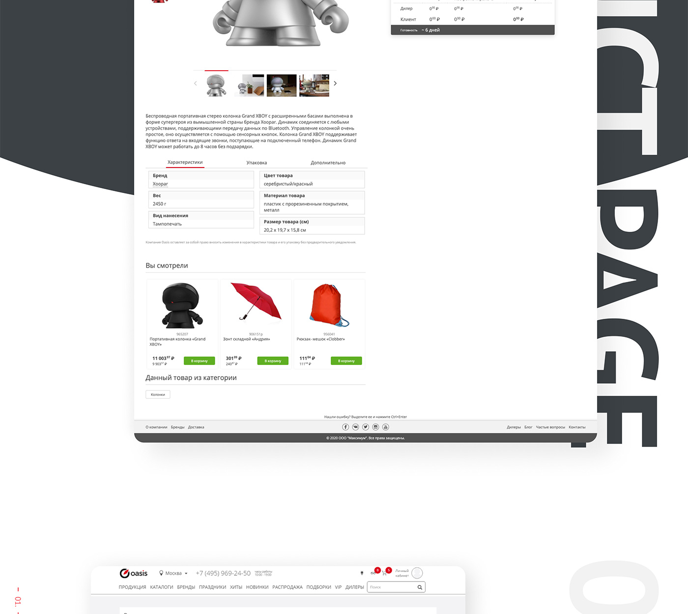
PRODUCT PAGE
Before the redesign, the product page was a scattered page with an inconvenient and incomprehensible arrangement of elements. One of the site’s essential pages was very far behind in ergonomics from the same page of competitors. It led to low conversions and distrust of the site as a whole. After the redesign, the page’s convenience and elegance increased tenfold, reflecting both in the increase in conversion and the customers’ positive reviews. A new visual series was built. The form of adding an application has changed and has become visually more straightforward and more advanced techniques. Images have been moved to the left. Warehouses are grouped. The main emphasis was on the “Add to cart” button.
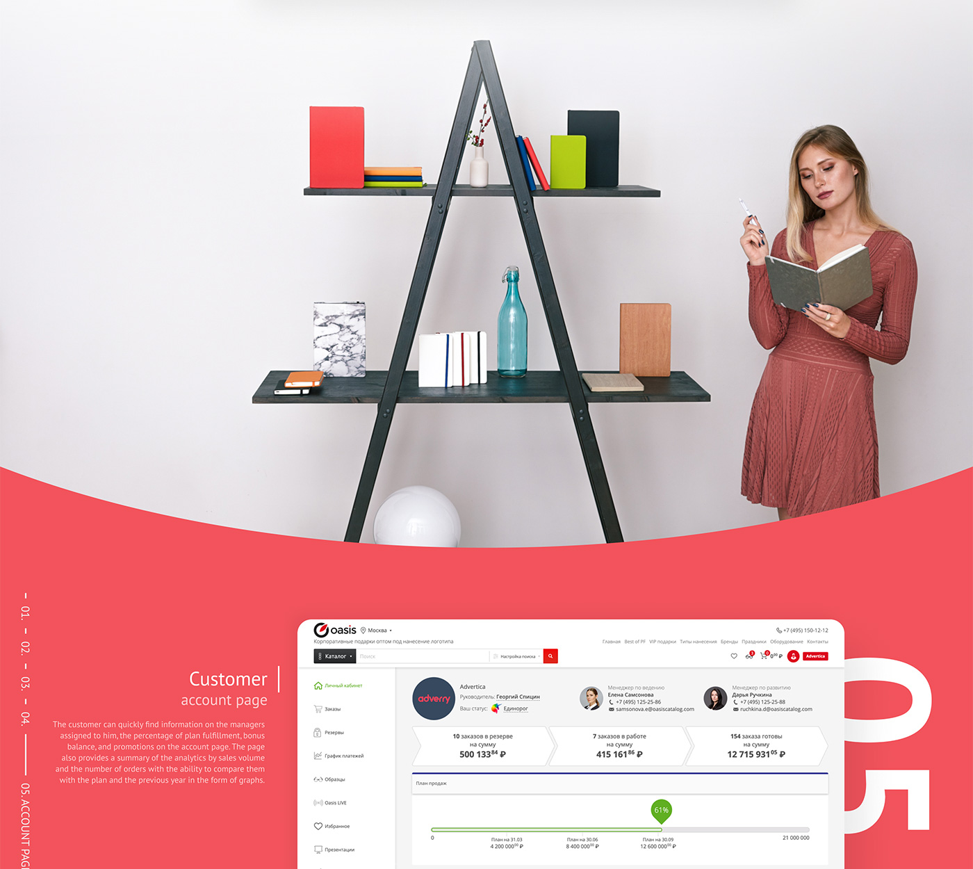
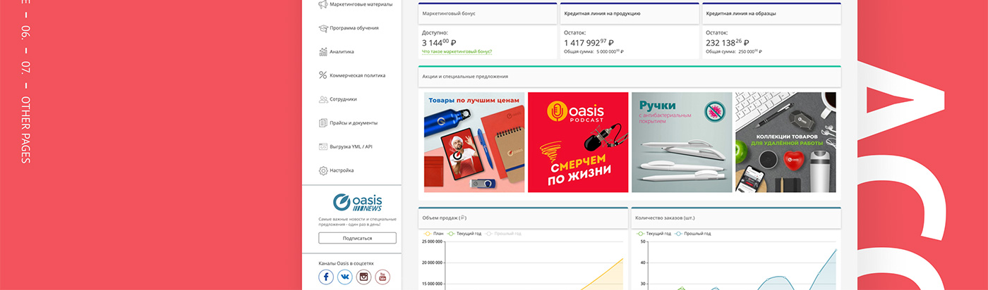
CUSTOMER ACCOUNT PAGE
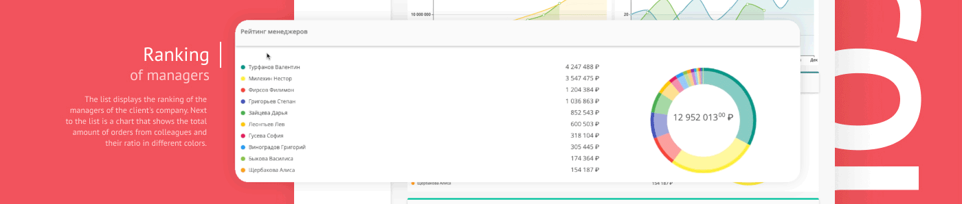
The customer can quickly find information on the managers assigned to him, the percentage of plan fulfillment, bonus balance, and promotions on the account page. The page also provides a summary of the analytics by sales volume and the number of orders with the ability to compare them with the plan and the previous year in the form of graphs.
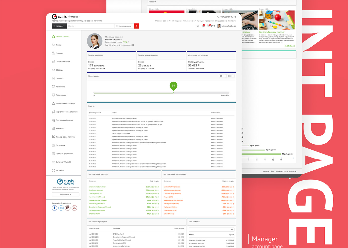
MANAGER ACCOUNT PAGE
The account page adapted to the needs of the company’s managers. The manager can find information on the plan’s implementation, the number of scheduled meetings, the status of customer orders, current tasks, the growth and decrease of orders from customers, and
other information on this page.
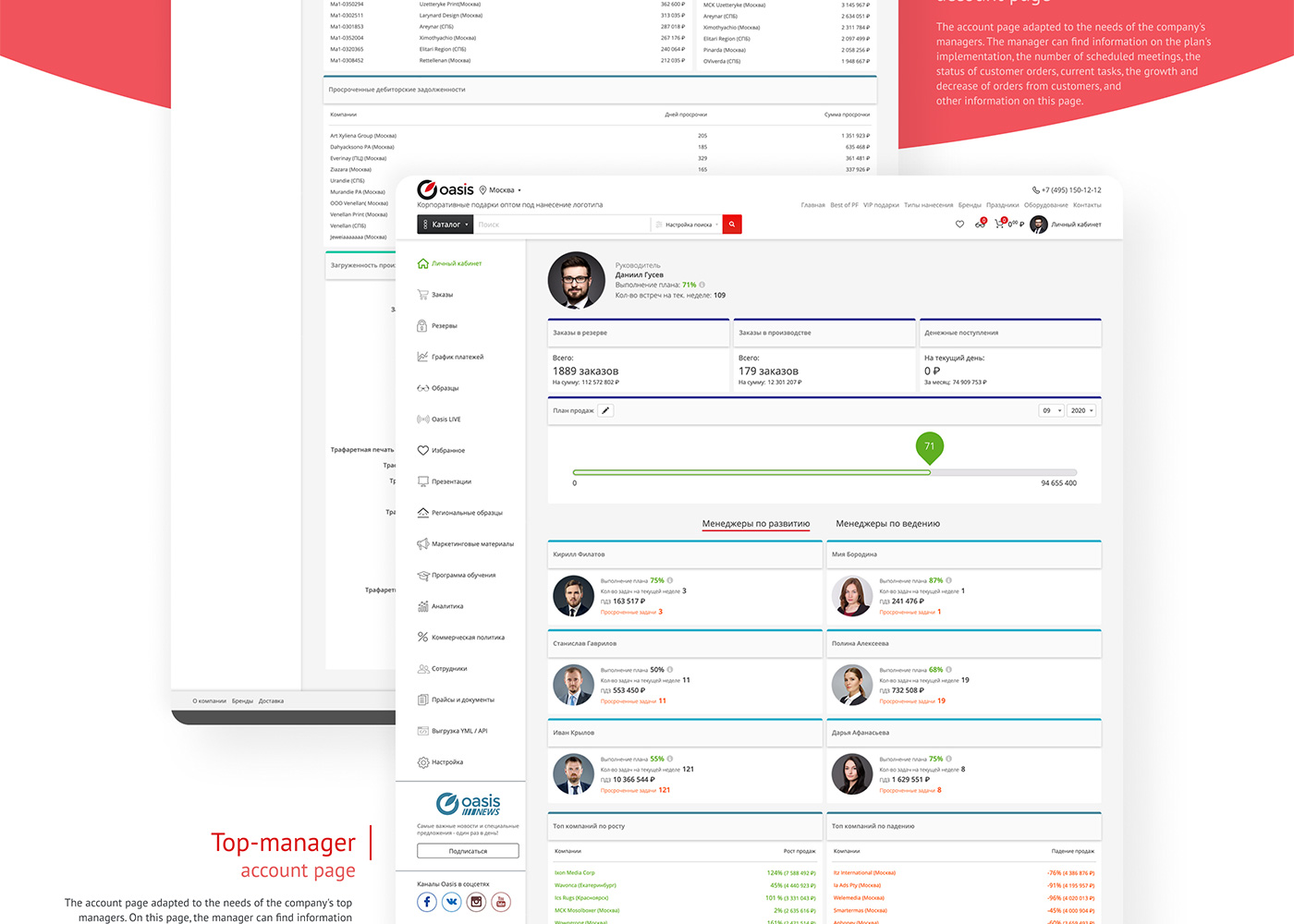
Top-manager account page
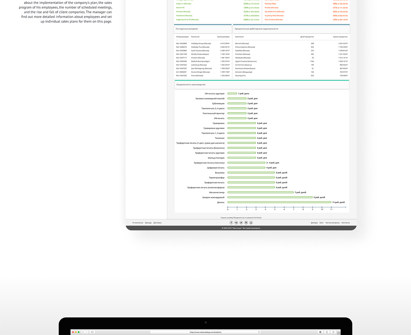
The account page adapted to the needs of the company’s top managers. On this page, the manager can find information about the implementation of the company’s plan, the sales program of his employees, the number of scheduled meetings, and the rise and fall of client companies. The manager can find out more detailed information about employees and set up individual sales plans for them on this page.
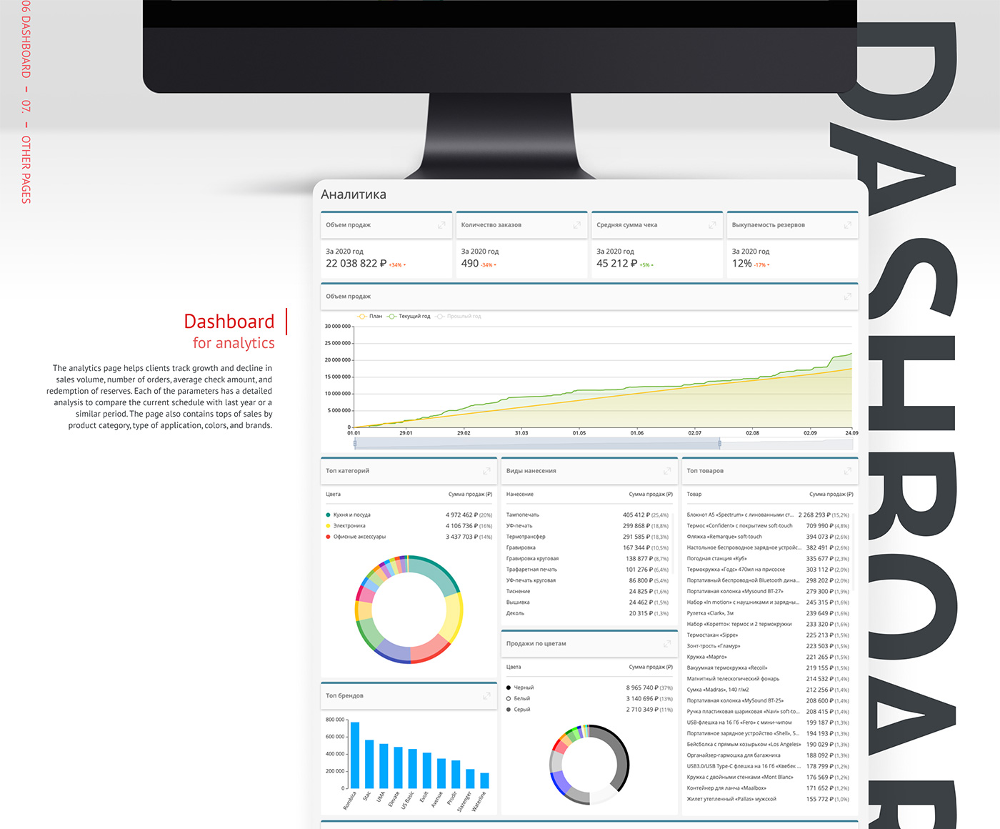
Dashboard for analytics
The analytics page helps clients track growth and decline in sales volume, number of orders, average check amount, and redemption of reserves. Each of the parameters has a detailed analysis to compare the current schedule with last year or a similar period. The page also contains tops of sales by product category, type of application, colors, and brands.
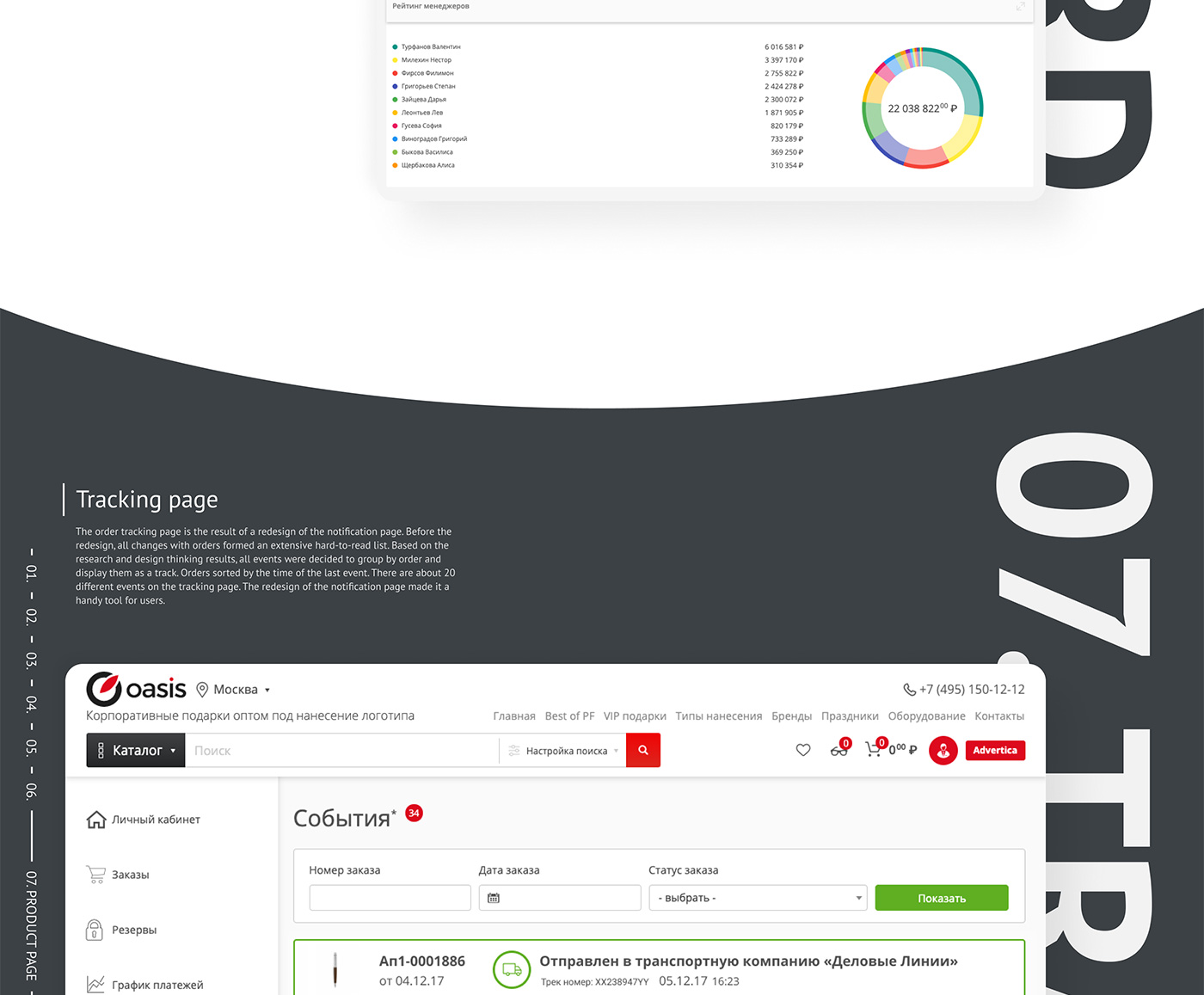
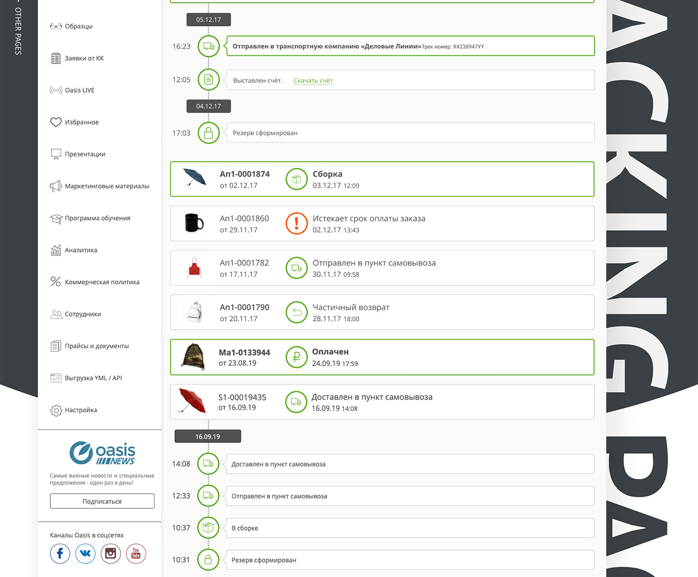
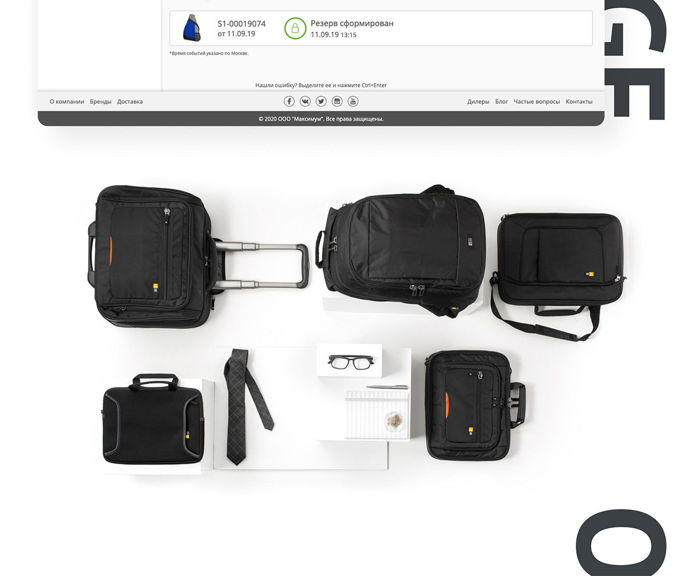
Tracking page
The order tracking page is the result of a redesign of the notification page. Before the redesign, all changes with orders formed an extensive hard-to-read list. Based on the research and design thinking results, all events were decided to group by order and display them as a track. Orders sorted by the time of the last event. There are about 20 different events on the tracking page. The redesign of the notification page made it a handy tool for users.