Artem Antonyan

Antonyan Artem

UX/UI Designer

How to create Big Sur icons

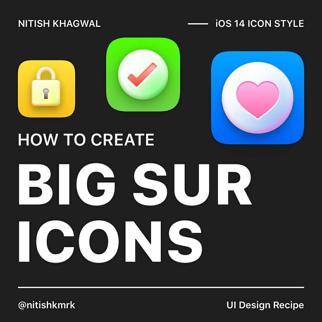
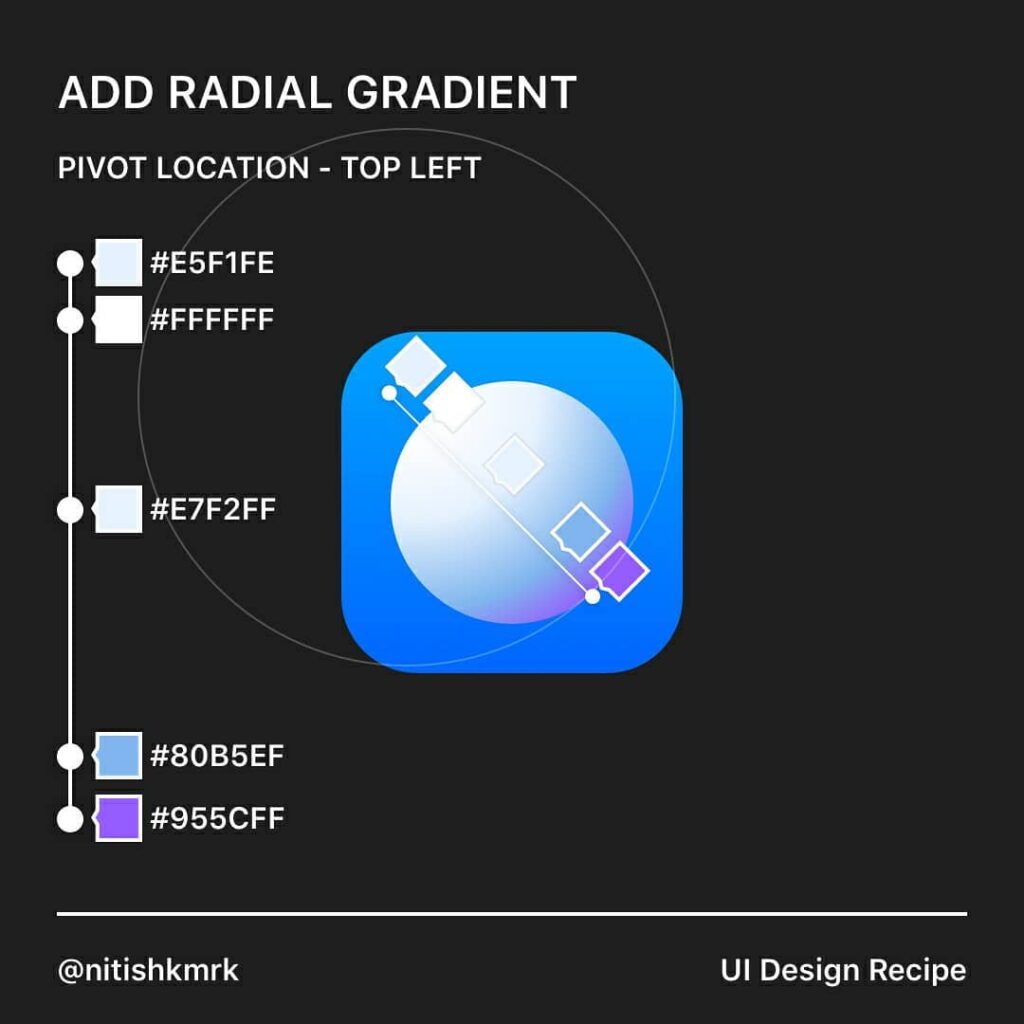
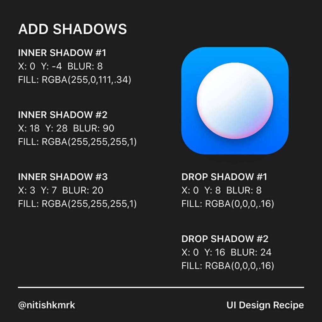
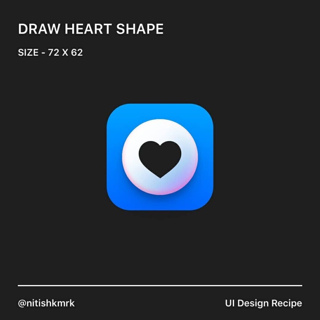
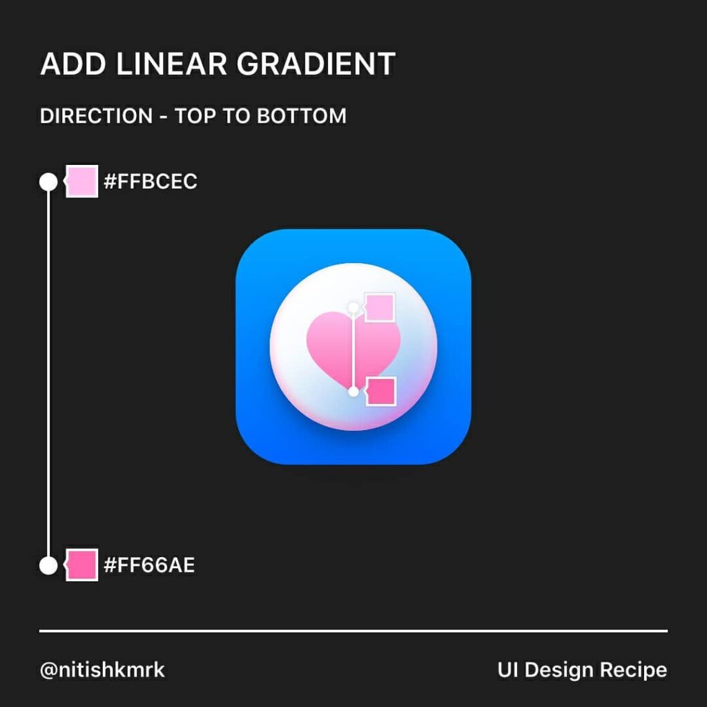
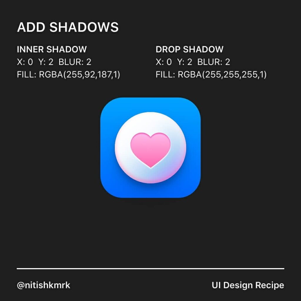
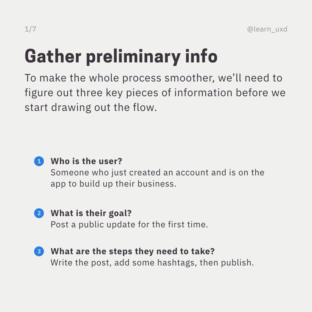
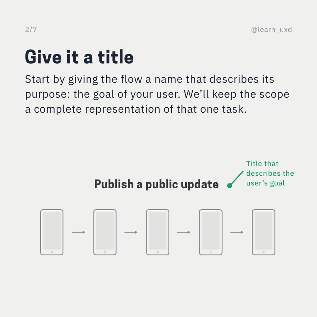
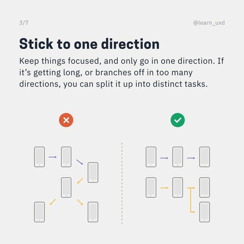
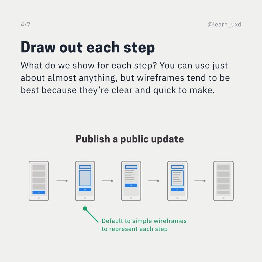
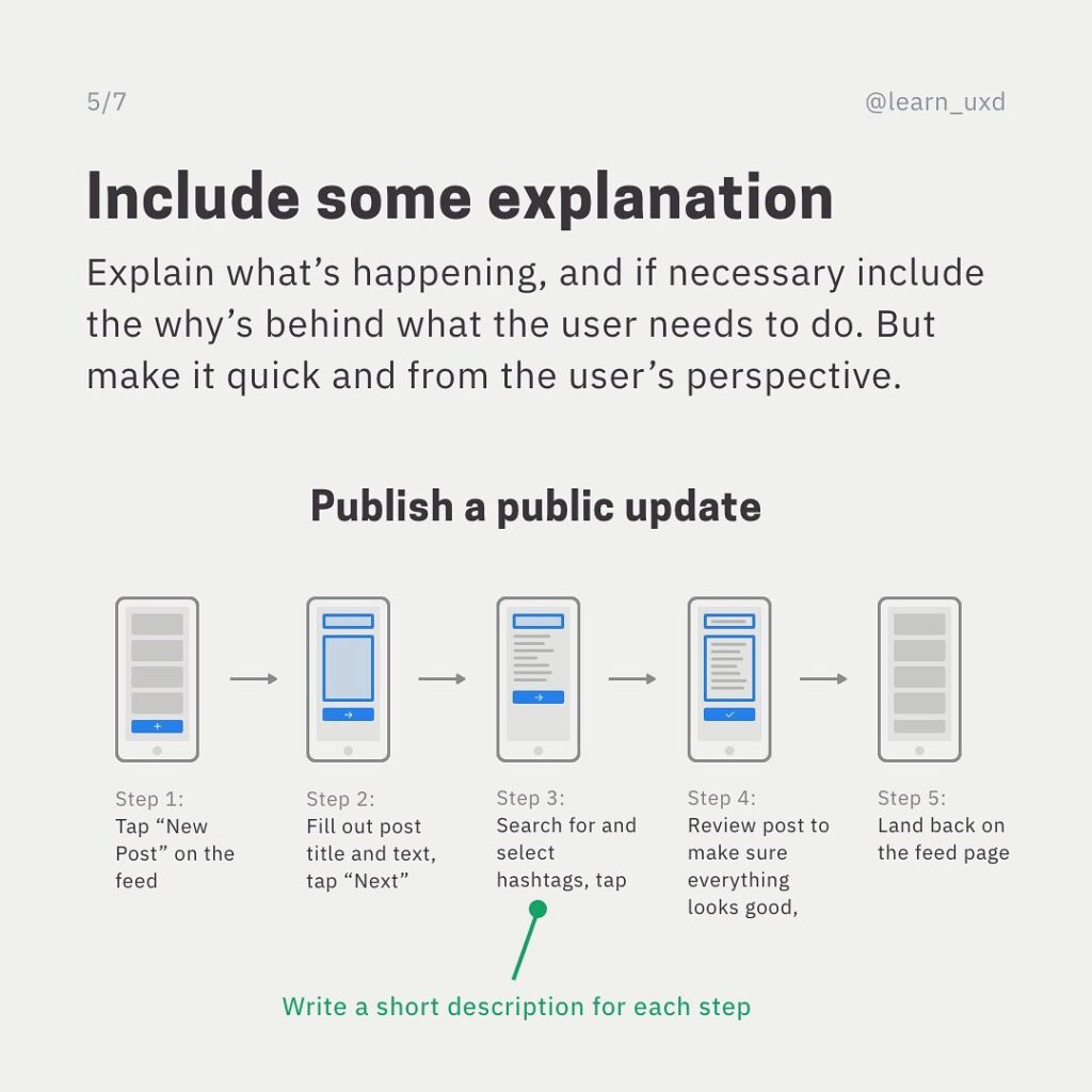
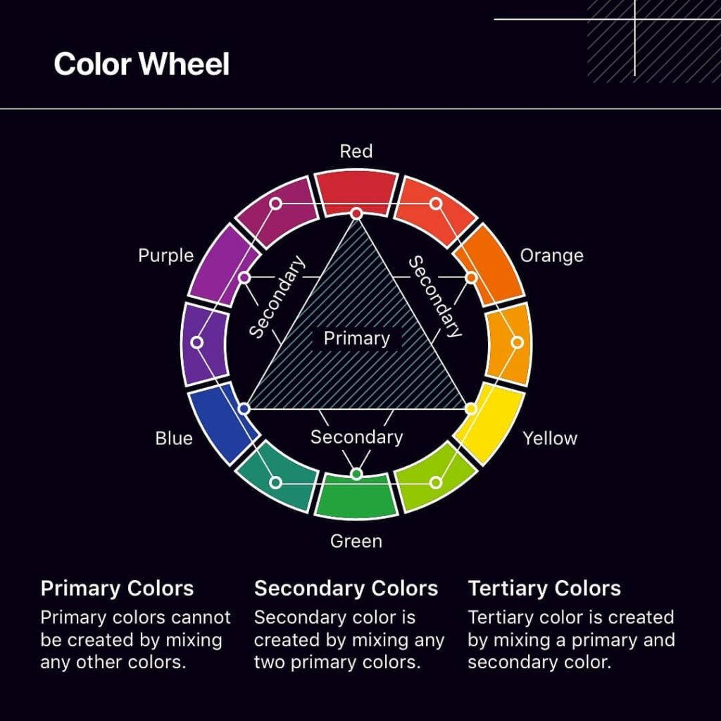
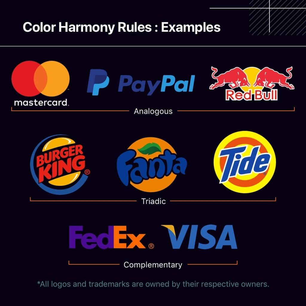
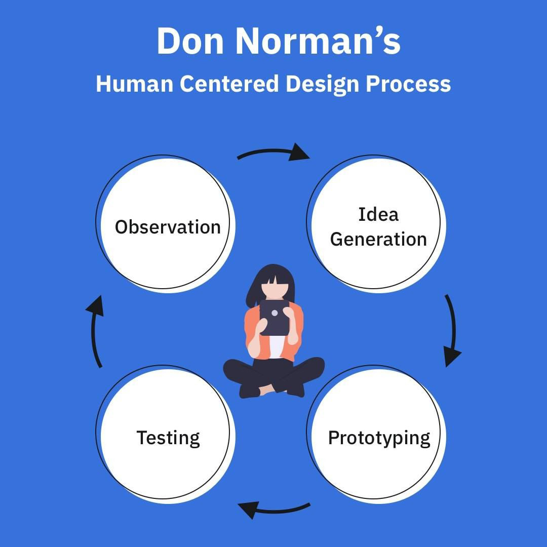
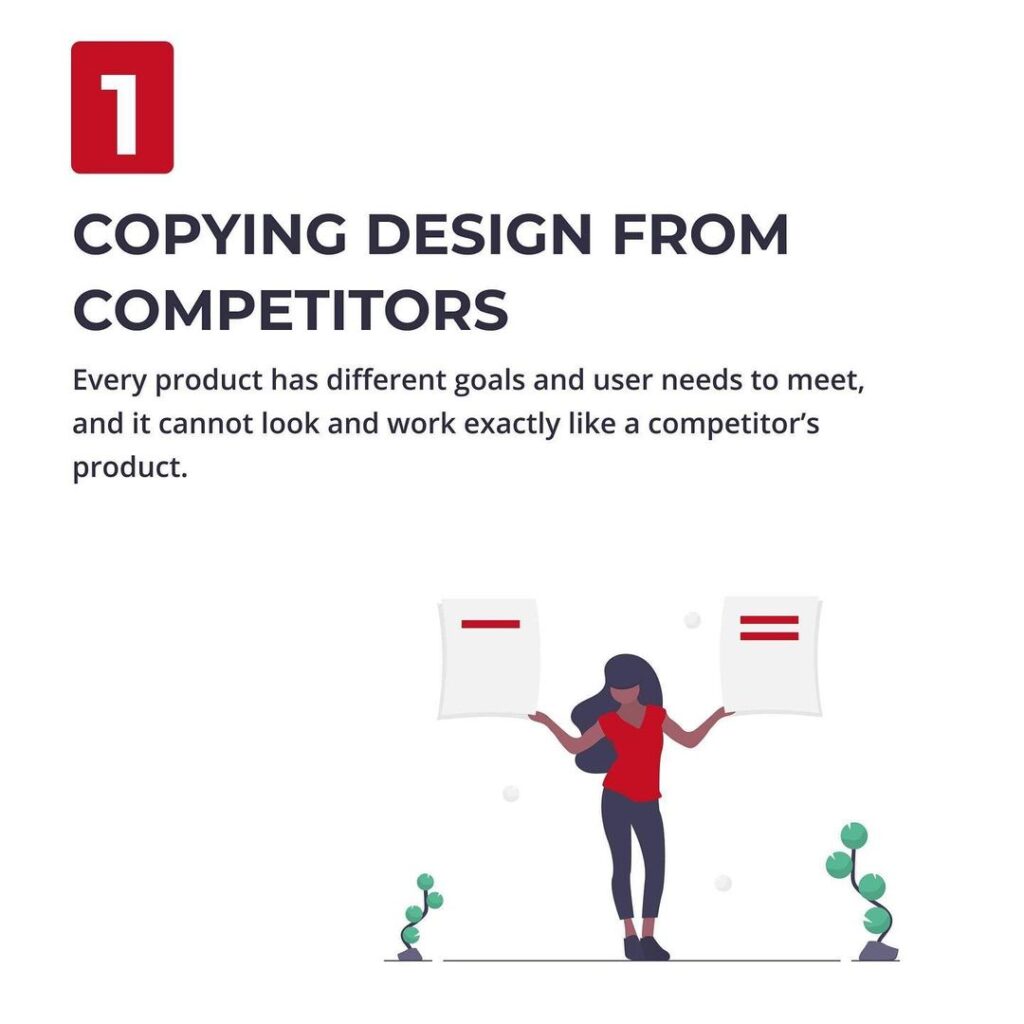
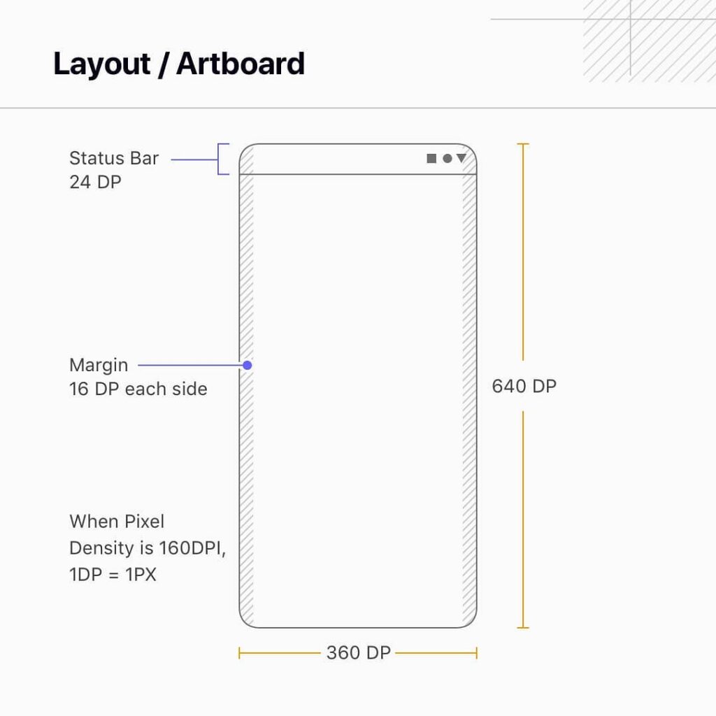
OS 14 and Big Sur are home. Apple always introduces some cutting edge design patterns, and this time we have Big Sur icon style.
⁣⁣⁣⁣⁣
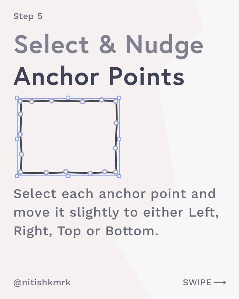
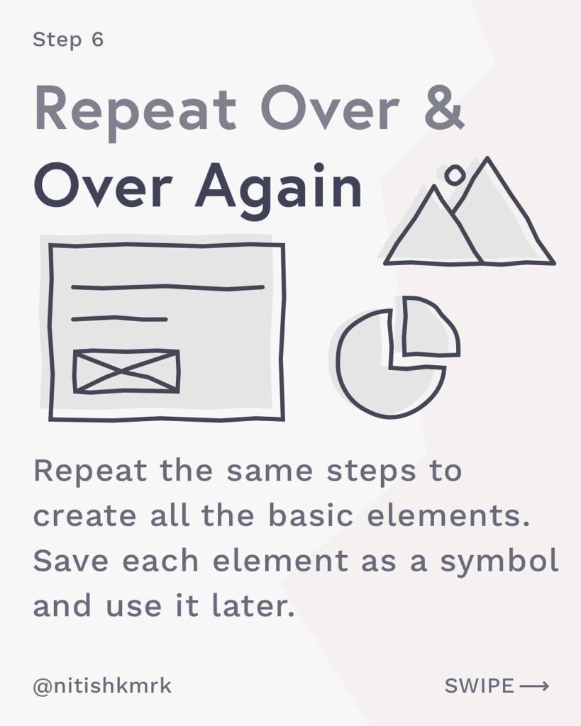
Big Sur Icon has more detailing over traditional icons, so need more attention and designing curve. I tried to streamline a step-by-step process to design such icons quickly.⁣⁣⁣⁣⁣
⁣⁣⁣⁣⁣
Soon clients or stakeholders are going to ask for them, So here is a quick follow-along guide, to excel Big Sur icon design game right now.⁣⁣⁣⁣⁣
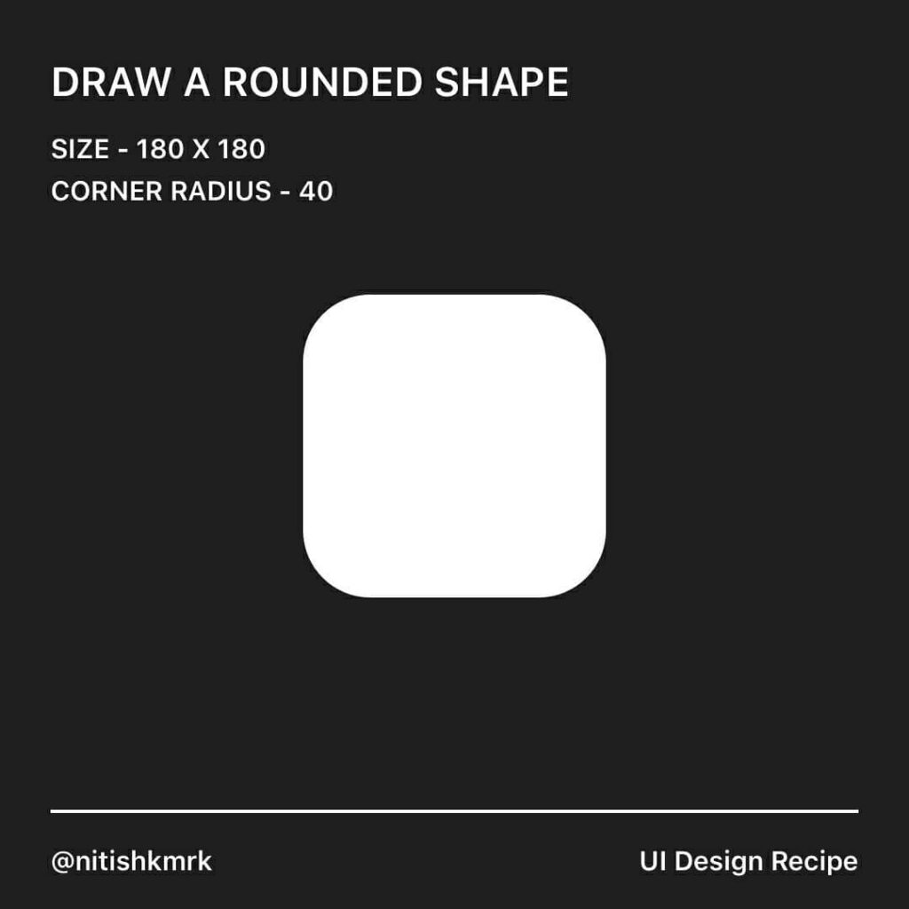
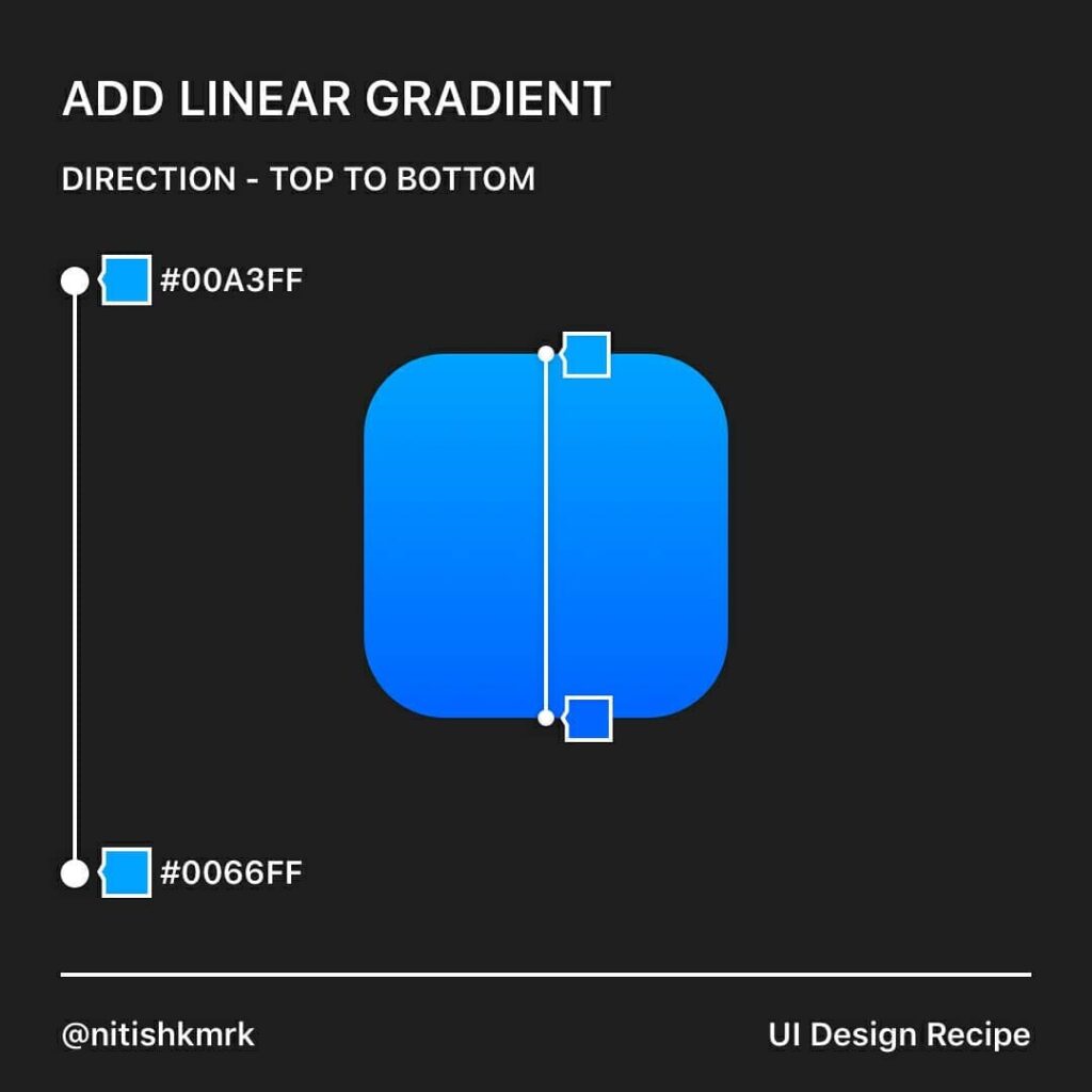
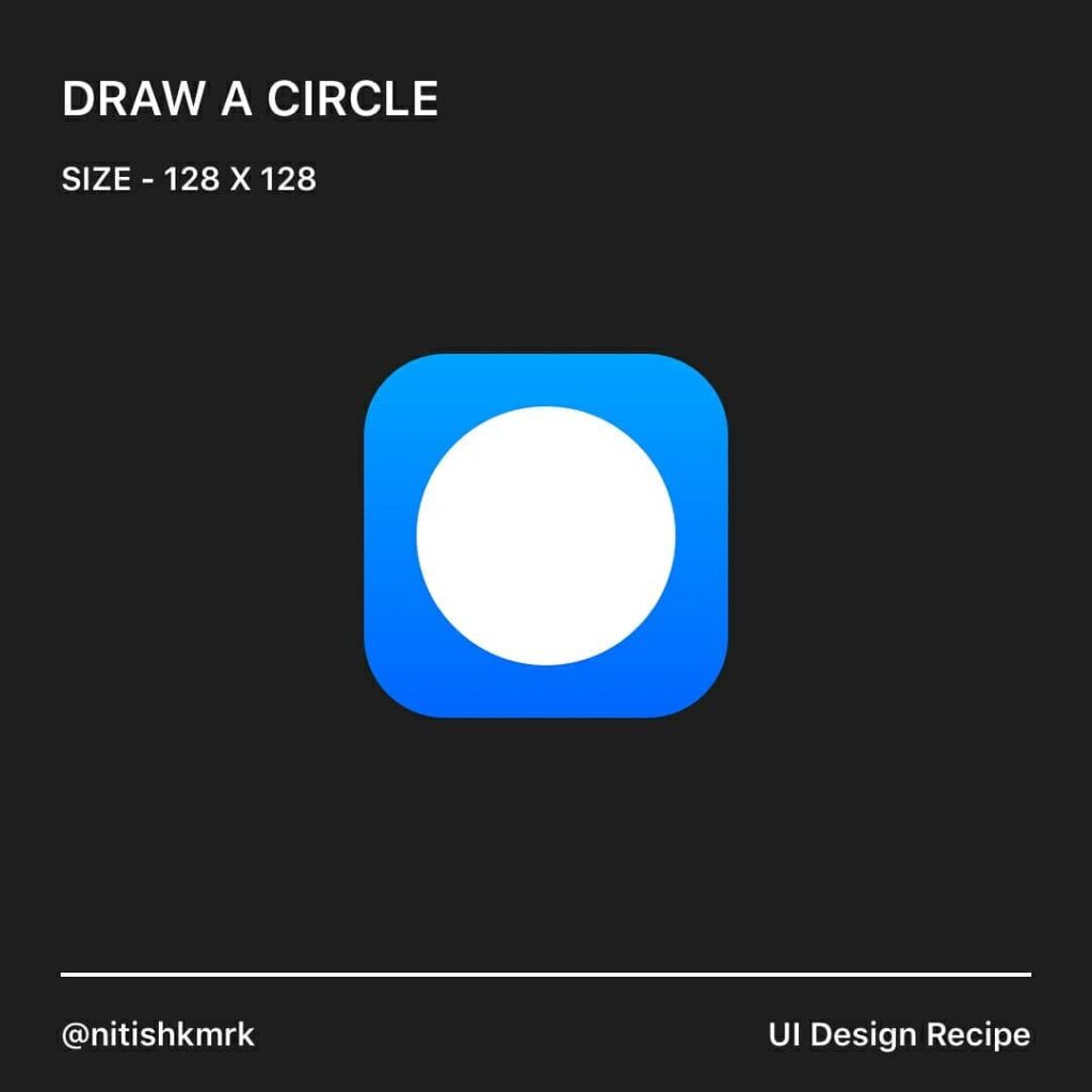
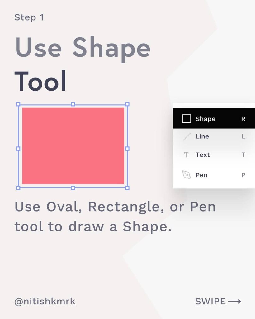
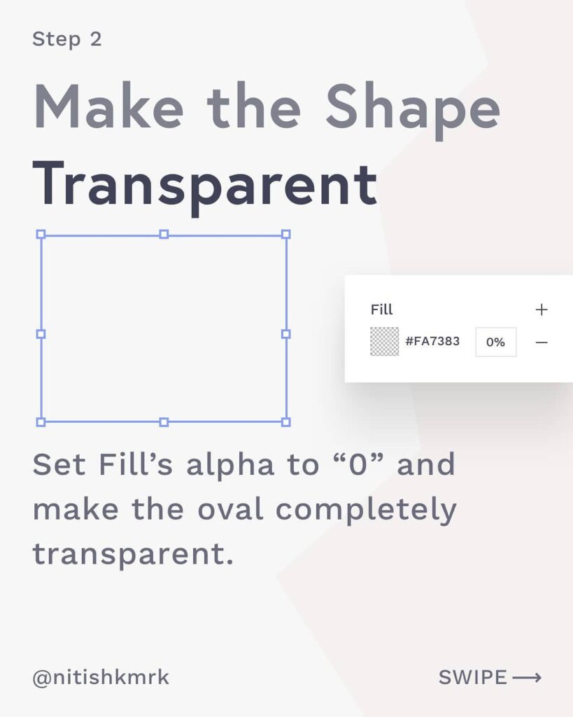
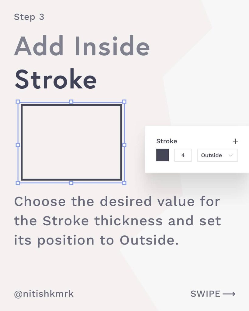
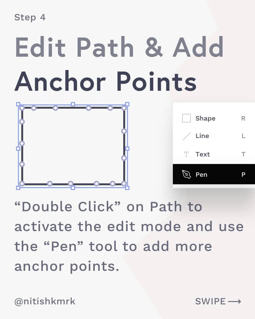
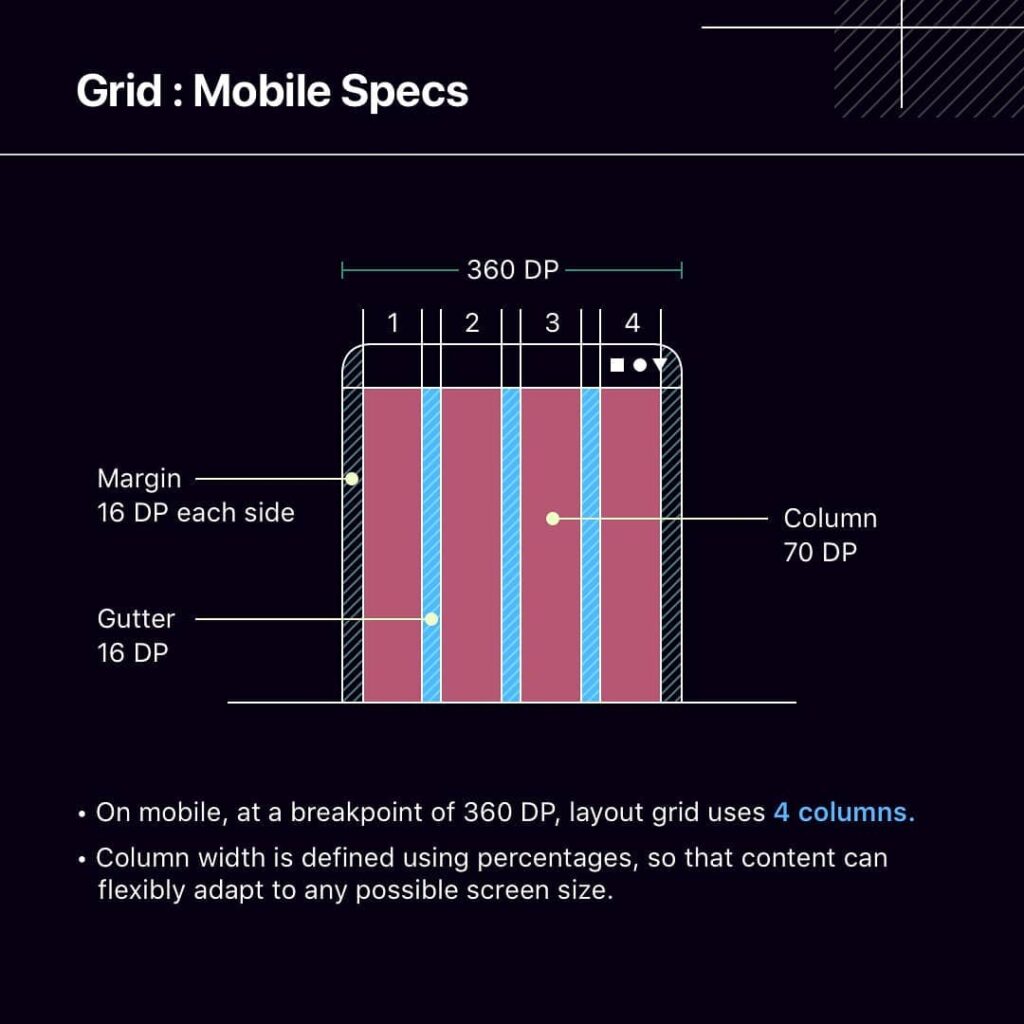
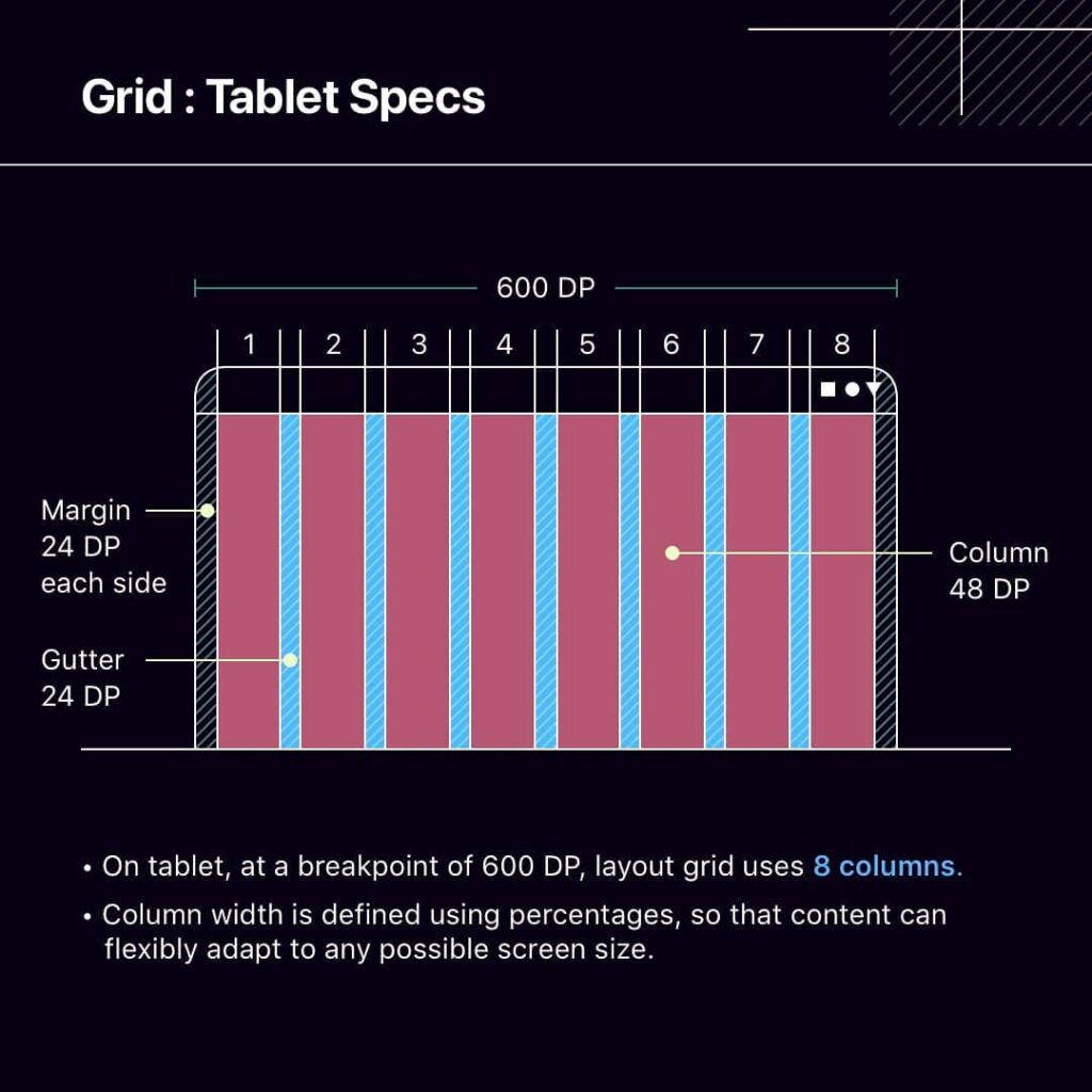
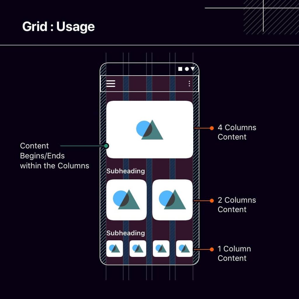
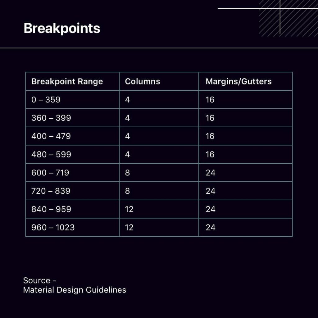
Perfect Typography System

Building good typography system makes design much easier and faster. I would like to share with you some tips I use in my projects:

1. Pick a typeface (use one, max 2 fonts)
2. Set base size (usually between 16-18px)
3. Create a type scale (use type-scale.com)
4. Set good line height (1.4-1.5 of font size)
5. Adjust tracking for better readability
6. Define meaningful colors

How to Build User Flows

A user flow is a series of steps a user takes to achieve a meaningful goal. It shows the path a user takes through the product as they complete a specific task.

It’s one of the most important tools of a UX designer.

In this post we’ll talk about how to build a user flow.

List of a UX/UI designer habits

This post will make you feel uncomfortable!!! It will make you push yourself out of your comfort zone!!! You will have to break the box!!!

Hand Drawn Wireframes

How amazing it will be if we can create fully editable hand-drawn wireframes on a fly, right inside our favorite tools like Sketch, XD or Figma?⁣⁣⁣⁣
⁣⁣⁣⁣
Let’s do it in 6 easy steps -⁣⁣⁣⁣
1️⃣ Use Oval, Rectangle, or Pen tool to draw a Shape.⁣⁣⁣⁣
Set Fill’s alpha to “0” and make the oval completely transparent.⁣⁣⁣⁣
⁣⁣⁣⁣
2️⃣ Select Oval and Choose the desired value for the Stroke thickness and set its position to Outside.⁣⁣⁣⁣
⁣⁣⁣⁣
3️⃣ Make the oval completely transparent by setting its Fill’s alpha to “0” ⁣⁣⁣⁣
⁣⁣⁣⁣
4️⃣ “Double Click” on Path to activate the edit mode and use the “Pen” tool to add more anchor points to the shape. ⁣⁣⁣⁣
⁣⁣⁣⁣
5️⃣ Select each anchor point and move it slightly to Left, Right, Top or Bottom.⁣⁣⁣⁣
⁣⁣⁣⁣
6️⃣ Repeat the same steps to create all the basic elements. Save each element as a symbol and use it later.⁣⁣⁣⁣

Color Design Guidelines

Colors rolls emotions. But if it’s a designer, sometimes it can roll tears too. Have you ever been confused about whether to choose blue with orange or red?⁣⁣

Colors are essential for making visuals appealing as well as bringing psychology and emotions to the designs. Picking colors and making swatches is a pretty easy task, but creating a functional swatch is quite tricky.⁣⁣
⁣⁣
I have created a quick swipe guide to quickly capture over the generic color scheme rules and glossary along with WCAG Contrast Levels.⁣⁣

Android layout grid guidelines

When we design mobile apps, we often face that nudge dilemma and not able to decide how many pixels an item or an object is supposed to move. In such a case, layout grids are a handy tool that can help us a designer to make faster alignment decisions while drawing apps.⁣⁣⁣

Human Centered Design

These are the basic phases in a human centred design process to ensure your product is valuable to your users. Remember: The process is iterative!

6 Common UX Mistakes

6 common design mistakes startups make?

?Copying Design from competitions
?No clear value proposition
?Ignoring mobile
?Not validating whether the UX works with usability tests
? Lack of focus

Mobile web design guidelines

Mobile Web design has a set of complications and needs a constant eye to avoid any pitfalls.

Designing for Mobile Screens can be challenging for a lot of reasons. Type size, touch targets, and pixel density are the most crucial things to look for while designing mobile-first interfaces. ⁣⁣⁣⁣

Android Design Guidelines

Android or Material Design guidelines are the foundation of any standard android app. If you design for android apps you must adapt to these material design guidelines, so that you can make your apps symmetric, consistent and more usable.⁣⁣
⁣⁣
Here is a quick swipe guide that gives a bold overview of the most-used components to help all designers excel in the basics of material design guidelines.⁣⁣

iOS Tablet Design Guidelines

When we work with type sizes, we should always make sure they are legible and have adequate contrast. If done wrong, it directly affects the legibility metrics.⁣⁣

A modular type scale is a sequence of consistent type sizes. We can construct a type scale either with standard scale values or a custom multiplier.⁣⁣

HOW TO INFLUENCE THE BEHAVIOR

Hey friends! Today I decided to give you some ”food for thought”. In this post I named my 5 favorite methods of influencing user behavior. 

Hope you enjoy this little project.

iOS Design Guidelines

Human Interface guidelines are the fundamental core of iOS mobile app design. These are must-adapt and to be known things if you don’t want to make your developers and app usability cry. I have designed a couple of iOS apps for now. So, I am sharing a few of the most-used artboards, bars, and typography specs so that you can get an initial help.⁣⁣

Яндекс.Метрика